The 'Adventure Ride' App
The Project
Adventure Ride is a mobile application that I designed as a portion of my UX Experience for my portfolio. As a UI/UX designer, I created this project from inception to completion using research, ideation, and UX design concepts.
Duration: 3 months.
Methods
surveys, interviews, card sorting, affinity mapping, preference tests, Usability Heuristics test, wireframes, and prototyping.
Tools
Diagram.Net, Adobe XD, Balsamiq, Figma
The Context
According to my research, one in every four Americans has a disability. Not everyone with a disability can explore and find tranquility in nature. And not everyone with a disability can use a mobile app to assist them to run errands. This app was created specifically for persons with disabilities.
Navigating a mobile application, on the other hand, might be intimidating and overwhelming. This app is designed to aid them in locating the most convenient way to seek assistance when preparing to go and explore nature on their own. This program is intended to provide them with the 24/7 care and help they require based on their medical records. Anyone can travel without having to worry about anything.
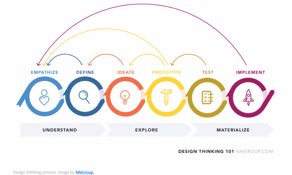
The Steps
Research – Define – Ideate – Prototype – Iterate
Research
Competitive Analysis
I researched two of the most prominent ride-hailing applications, Uber, Lyft, and Grab, to gain a better knowledge of the competitive landscape. I discovered that no smartphone app gives a lot of information to disabled passengers. This could be burdensome for all persons with impairments who require transportation, particularly for the weekend gateway.
Surveys
To learn how people with disabilities can find mobile apps problematic due to their navigation material, which the presently offered apps on the market offer in their apps that are not seamlessly easy for them. I wanted to know how users' responses would differ based on their disability, so I included the most important feature in the mobile app: screen readers, which are software apps that transform onscreen text to audio or braille.
Interviews
During my studies at OSU, I was part of the DAS (Disability Association Service) where I met some of the students who I could interview for this project. The main questions to them were how challenging it is for them to travel over the weekend by themselves if they wanted to be taking Uber, Lyft, or Taxi; How difficult it is when they take Uber or Taxi but at the same time they require some help to accommodate them getting into the car or going out of the car, and what makes them feel traveling alone is not safe for them. They had never traveled outside of the house by Uber or taxi alone even going to the beach. A company from their family is necessary.
Besides that, I always care about people who need assistance to do some daily errands. Looking at my boyfriend's twin who has epilepsy made me think of a new finding in the design of a mobile app. From analyzing what currently available mobile apps are lacking for users with disabilities and what are not. Because he can't travel or take Uber alone. There should be somebody who helps him get everything assisted daily. However, I always believe that there should be no boundaries for every disabled person to do anything in this world as long as they have access to it. And it is the year 2022 when technology and other simple but important features need to be added to help people who do not have the same mobilities as normally healthy people.
Both surveys and interviews conducted have helped gain better research and analysis.
Define
Problem Statement
In this instance, all passengers with disabilities require a way to find an easily understandable and reliable service that can provide them with a long but safe ride, as well as understand their needs and constraints, because they need to make informed and safe decisions about their travel plans for the day.
User Personas
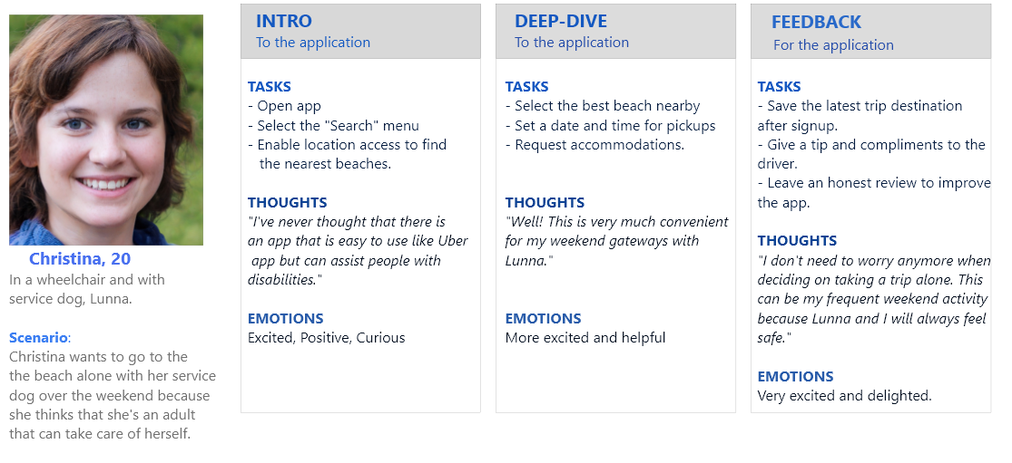
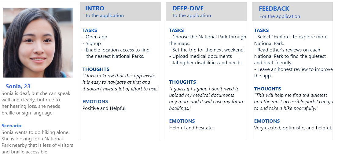
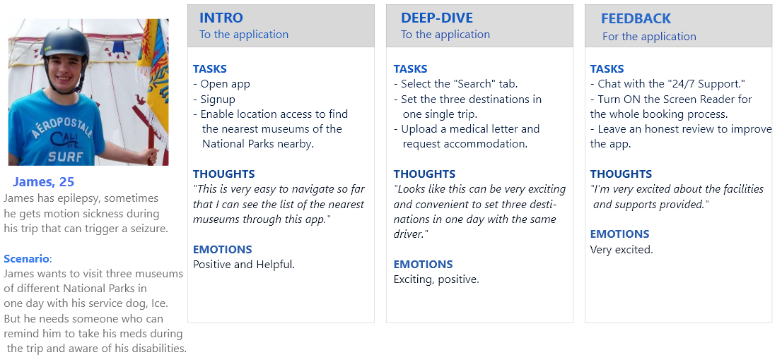
Using the Design Thinking process, I developed user personas based on people I met who had similar needs. I also considered their emotions when determining their personalities. They discussed their experiences and daily challenges, particularly when it comes to travel.
As a college magazine journalist. I frequently interviewed persons I thought would be great for my story. As part of my job, when it comes to interviewing sources and conducting analyses, I always make sure that I understand their true emotions by putting myself in their shoes and "seeing" things through his/her eyes when they contribute to my story articles or projects. I always value their input and appreciate their time. The veracity of the information I acquire is critical to comprehending User Interaction.
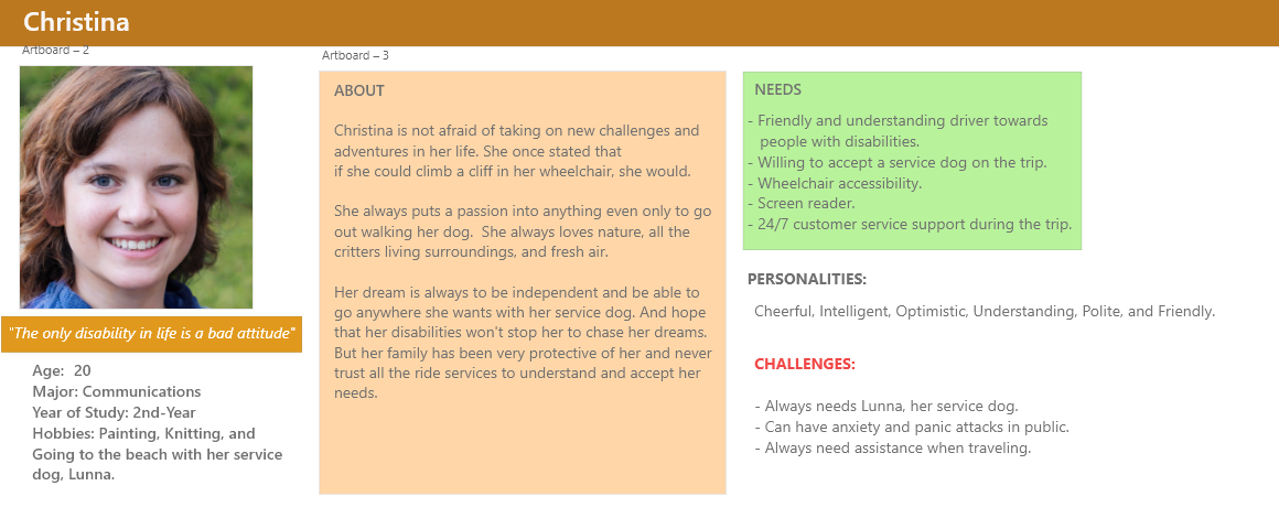
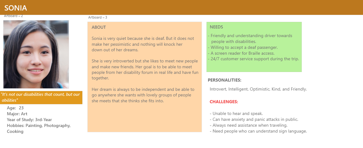
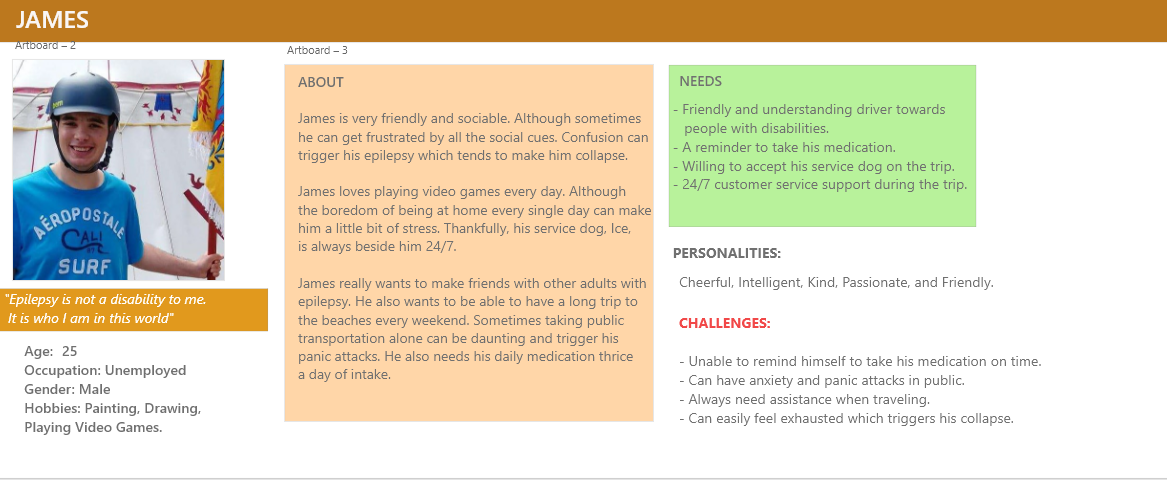
I created these User Personas using Adobe XD.
I returned to these user personas frequently to remind myself of my users' requirements and problems, and to keep a user-centric focus throughout the project.
Mental Models
I constructed a mental model for each user persona using all of the research I gathered to comprehend how the user would interact with the app and to deliver a highly intuitive user experience.
Using Jakob's Law, which asserts that because users spend the majority of their time on other sites, they anticipate a site to function similarly to other sites they've visited. I could then draw each user's perspective on the design.
I created these Mental Models using Adobe XD.
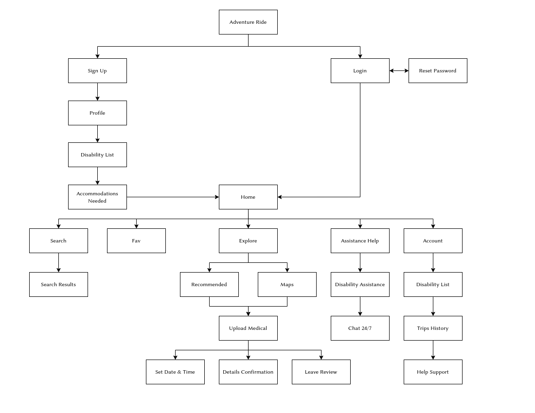
Site Map
With these basic characteristics in mind, I ran a card sort to get a sense of how consumers may anticipate the content to be organized and displayed and then utilized the results to develop a sitemap.
Ideate
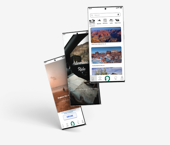
Low Fidelity Wireframes
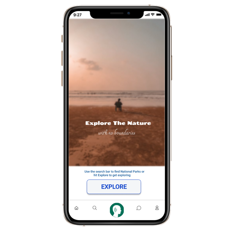
Because one of the main goals of 'Adventure Ride' is simplicity and ease of use, the number of screens was kept to a minimum and I wanted to focus on displaying the key functions. I usually began with pen drawing on paper. Still, in this case, I use Balsamiq to develop numerous iterations of each screen until I discovered a combination of features and aspects that I thought would match the users' demands and be as intuitive as feasible.
Then, in Balsamiq, I created the mid-fidelity versions of these wireframes, a clickable prototype, and had one person who has disabilities test them out.
Test
Usability Testing
I was able to refine what users found beneficial and entirely change what they didn't like by running usability studies. The users were required to complete a few scenario-based tasks that tested the app's primary capabilities, and I also asked them about their feelings about the app overall. The findings of the usability tests were documented and analyzed using a spreadsheet and an affinity map.
Key Findings
I took notes on the positive and negative input so that I know what areas to continue developing on and what needed to be improved.
Positive Findings
- Users were able to perform tasks promptly.
- Users have praised the concept of providing a function for requesting accommodations for various disabilities and needs.
- Users found the navigation to be very easy to understand.
Negative Findings
- Users were perplexed by the 24-hour customer service, which was not yet available.
- Users have some difficulty locating information.
- Users reported that the text and icons were difficult to read.
Iterate
Design Changes
I made improvements based on user feedback and then I browsed on the internet how most developers design their great and interesting apps that are now available in the market. I developed a higher-fidelity version of the app with more white space, larger icons, and clearer typography.
To guarantee uniformity throughout the app, I used the Gestalt Principles, grids, and color theory in my design.
Final Product
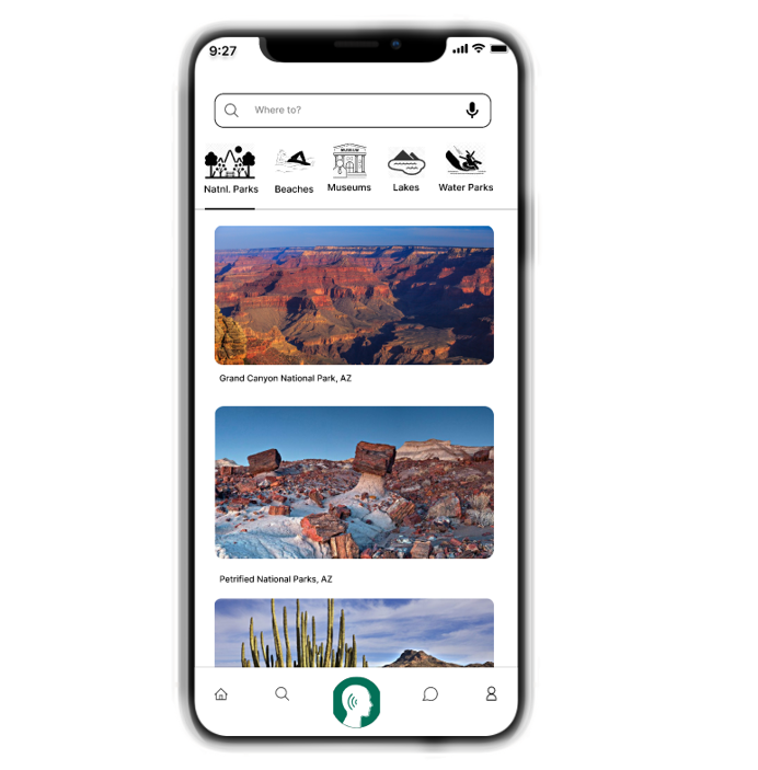
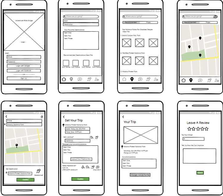
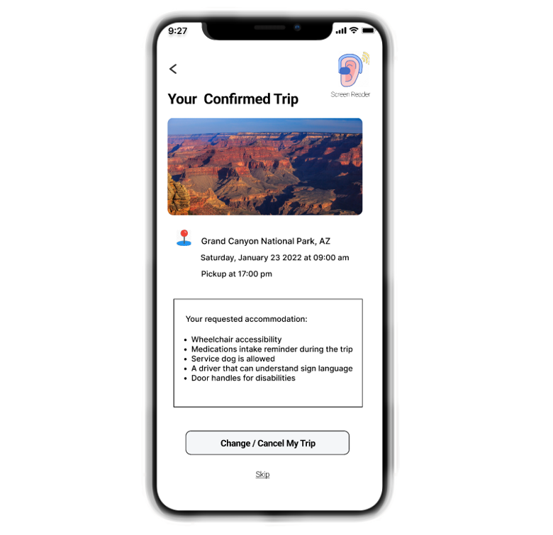
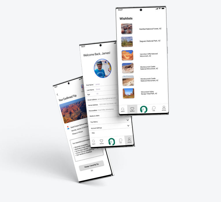
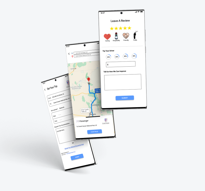
After numerous tests and modifications, my final product met all of the goals I set for it, including the three core features necessary, which are the Screen Reader, the 'Upload Your Medical Documents' option, and the 'Change/Cancel My Trip' option for users to book a trip conveniently and safely, while also seeming visually appealing and simple to use.
Click here to view the Final Interactive Prototype!


Revisions to the final design

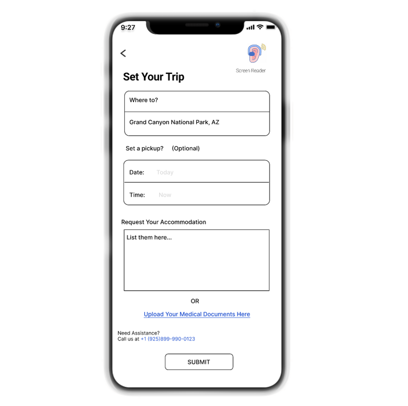
I revised the 'Leave A Review' design to have more vibrant and fun looks, where users can add complimentary by choosing which icons they think better describe the driver's overall service and behavior.
UI Element
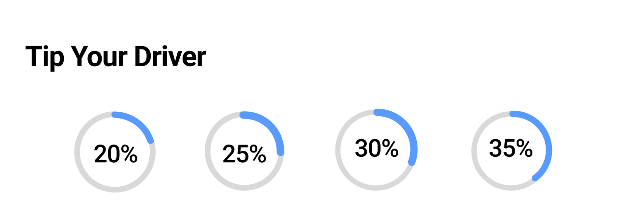
With the tip suggestion ranging from 20% to 35% demonstrated in percentage charts gives much more clarity on how much tipping is appropriate.

I added a 'Wishlists' page to the design because listing the future destinations in a wishlist is very necessary for this type of ride services app.